Revision and Finalisation
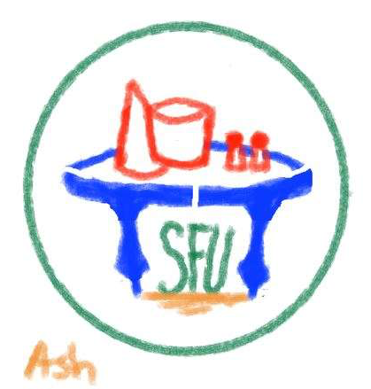
First Sketch
After being selected as a finalist, I received feedback on my logo sketch. I was asked to convert the design into a vector image and to replace the ambiguous shapes with clearer references to tabletops and other board games. Additionally, they felt that the overall composition was taller than preferred.

First Vector
This was the first vector I created based on my initial sketch and the feedback I received. The composition was relatively short, lacked clear references to other board games, and featured table elements that were disproportionately large. Additionally, there were concerns about the use of black in the design.
Second Vector
This version was intended to appear simple from afar, with more detail revealed up close. Element sizes were refined and additions made for better balance.While it wasn’t the right direction, it clarified that both vector designs were too cluttered and confirmed that bold black outlines were the right choice.

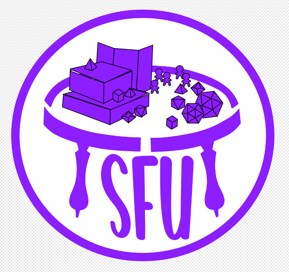
Fourth Vector
At this stage, we had aligned on all major design decisions except for color. Drawing inspiration from the SFU logo, we introduced deep reds and cool greys, complemented by neutral beige and blue tones to complete the palette. However, this combination made the logo feel too dark..
Fifth Vector
This time, we looked to past tabletop club logos for inspiration and chose to honor them by incorporating orange into our palette. To maintain a bright aesthetic and create contrast, we introduced blue as the secondary color, along with its complement, dark blue.
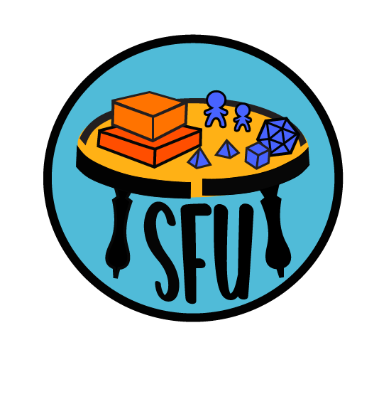
Final Logo
Once we finalized the tri-color palette, the logo was considered to meet all the desired criteria. The final steps involved refining the design and slightly adjusting the saturation to soften the overall look. With those changes complete, the logo was approved and quickly adopted for official use.
Refining the Vision
After being selected as the logo designer, I went through several rounds of review and revision to ensure the final design aligned with the club executives' vision. Throughout this process, I adapted my original concept to meet their needs, incorporating changes ranging from major structural adjustments to refinements in color, line weight, and curvature.
This phase was all about precision—ensuring every detail matched the client’s expectations. It demanded a sharp eye for detail and thoughtful decision-making, qualities I bring to every design project I take on.